Start with our signature.
Use the supplied logo artwork. The decorative ribbon can frame a story, but the official logo identifies the Chorus separately.
SFGMC / BRAND RESOURCES
Logos, colors, typography, and examples for making something that feels like us.
Open Graphic StudioStart here
Extraordinary music. LGBTQIA+ visibility. A powerful community.
Founded in 1978, San Francisco Gay Men’s Chorus connects people through performance, education, and community. Keep the identity clear and give the people, performance, and message room to lead.
Use the supplied logo artwork. The decorative ribbon can frame a story, but the official logo identifies the Chorus separately.
Primary red, charcoal, and white anchor the identity. One coordinated dark/light pair gives a campaign its own mood.
Use clear words, authentic photographs, and a readable hierarchy. Lead with one message and a clear invitation.
Logos
Configuration and color are separate choices.
Choose an approved logo with or without the organization’s name, in full color, white, or black. Use the version that reads clearly against its background.
For dark backgrounds, choose the full-color logo with white text or the all-white version. Both retain the approved artwork.
Keep it away from page edges, text, and busy photography. Preserve proportions and ensure the organization’s name remains readable.
Do not stretch, redraw, recolor the full-color file, or add effects. Choose supplied one-color artwork when needed.
PNG is a ready-to-use pixel image with transparency. Use it in social graphics, documents, and presentations; enlarging it can soften edges. SVG is vector artwork that stays sharp at different sizes. Use it in compatible design tools or give it to a designer or printer.
Use the symbol alone when SFGMC is already clearly identified or a compact mark is appropriate. Measured minimum sizes and clear-space specifications remain to be confirmed.
Colors
Our primary foundation. Eight expressive families.
Primary red is the recognizable accent; charcoal and white provide the foundation. Use cool gray for quiet surfaces. Keep a campaign within one family rather than mixing several pairs.
Digital HEX and RGB references are not approved Pantone or CMYK specifications. Ask your printer for a conversion and proof.
Preview headline and logo treatments independently. Click the HEX controls beneath each sample to copy its color.
Each pair’s contrast ratio is shown on its card. Use the pair’s dark and light tones together for text. Normal text should reach 4.5:1; large text should reach 3:1. Contrast over photography must be checked separately. Never use color alone to communicate meaning.
The full rainbow gradient stays together as one continuous horizontal bar at the top of a page, matching the website. Preserve its complete sequence and direction. Do not extract individual colors or scatter the gradient as decoration.
Type
A strong headline. Clear supporting details.
We Sing Love.
Use Degular Display for short, expressive headlines. Let the words be large and give them breathing room.
Extraordinary music.
A powerful community.
Use Degular for section titles and supporting headings.
Music brings us together. Use clear, welcoming words and comfortable spacing so every message is easy to read.
Use DM Sans for body text, dates, captions, and practical details.
Use Degular Display and Degular with appropriate access and licenses. If unavailable, DM Sans can keep a draft consistent; Arial is a practical fallback for files that must work on another computer. These are working substitutions, not additional official brand typefaces. Recheck line breaks after a substitution. Use a PDF when the shared layout must remain fixed.
Imagery
Show what the Chorus makes possible.
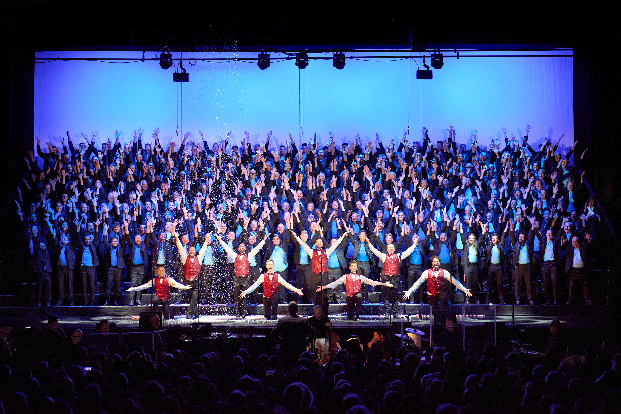
Show performances, rehearsals, audiences, education, and community. Choose an image connected to the story. Keep faces and meaningful details visible.
Credit the photographer and add context when available. Use authentic photographs for documentary or historical claims. Make the role of AI artwork clear when used for a new creative concept.
Keep text away from faces. Use the studio’s gradient behind headlines to help readability, and review the final crop in each format.
Browse Stefan Cohen’s 2025 Holiday galleryThe Studio’s photo menus include the gallery link and password help.
Words
Warm. Confident. Proud. Human.
Invite people in. Be specific about the music and its purpose. Make room for joy, humor, remembrance, and care. Use the full name on first reference, then SFGMC or the Chorus. Explain unfamiliar program names and use names and pronouns accurately.
San Francisco Gay Men’s Chorus brings people together through extraordinary music, LGBTQIA+ visibility, and a shared commitment to community.
Founded in 1978, San Francisco Gay Men’s Chorus creates extraordinary musical experiences that build community, inspire activism, and encourage compassion. Through concerts, education, and outreach, SFGMC celebrates LGBTQIA+ lives and connects people through the power of singing together.
Descriptions and voice notes are proposed working copy for review.
Be playful, personal, and a little cheeky. Pair the invitation with a show title, accurate dates, and a clear ticket CTA. The studio’s Random message button offers editable starting points.
Come hear me sleigh.Holiday Spectacular · Get tickets: SFGMC.org
In action
Expressive graphic. Separate identification.
The enlarged ribbon can frame photography, create movement, or become part of a composition. In this role it is a design element; include the official SFGMC logo separately.
Use a dark field with its light partner for headlines, or reverse the treatment. Keep the palette coordinated.
Choose photos for the story, then a pair that complements their lighting and mood.
Select the approved logo lettering that reads clearly against the background.
Check the post and its destination before exporting. Thumbnail crops can hide information visible in the full graphic.
Examples are concepts, not published event announcements. Holiday examples use 2025 photography by Stefan Cohen to illustrate 2026 promotions. Photo credits and editorial notes.
Create
A reference when you need it. A studio when you are ready.
For organizational information, education, community, and giving, keep charcoal and white dominant. Use approved logos and typography, with the complete rainbow bar reserved for the top of a page.
Give the show its own mood with one tonal family and expressive photography. Keep the concert name, dates, and ticket invitation clear.
Use the ribbon to frame imagery and add movement. Preserve the logo as a separate, legible signature.
Choose your format, make the message yours, pick colors, adjust photos, then preview and download.
Show me the five stepsCreate a graphic